design your own Moving Billboard
Your own Moving Billboard will soon be trucking through the Netherlands. How cool is that! Whether your billboard is moving or stationary, it’s important that it stands out. But how do you ensure that your lorry advertising attracts every motorist’s eye? In this blog we’ll tell you more about successfully designing a moving billboard, so you’ll soon have a cool, unique and eye-catching design. A design that really makes an impact. So: ‘Buckle up! It’s gonna be a bumpy ride, but we promise it’ll be worth it!’
Inspiration for lorry advertising
Get your creative motor running and start designing your Moving Billboard. Because freedom and creativity encourage discovery, free thinking and experimentation, which leads to the creation we desire. Uncertain if something works or if the design will remain legible? Take it easy, you don't have to reinvent the wheel. Want inspiration and see how other brands did it? Cruise on over to our Instagram or LinkedIn page where we regularly post updates about brands that have also chosen to use Trailermade Advertising. And we're happy to brainstorm along with you and steer you in the right direction if needed. Below you'll find all the things you need to think about during the design process or when writing your brief for the graphic designer.
Scalability and clear communication
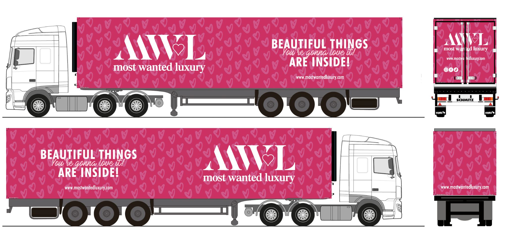
When designing the advert for the trailer, you must take the enormous surface area into account. A trailer is usually 13.6 metres long and 2.65 metres high. Make sure the design works on this scale and clearly communicates the visual message. The design must be recognisable from a distance, because the time to convey your brand identity is usually short.
The power of simplicity
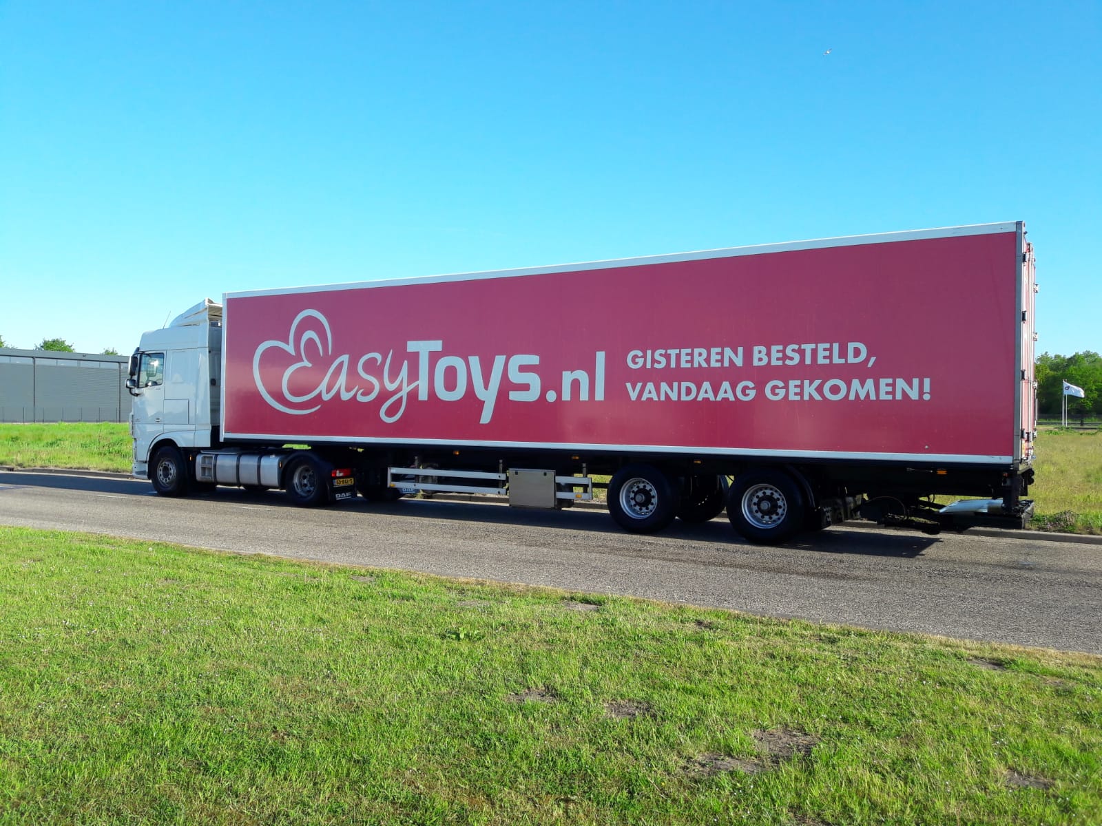
Avoid trying to communicate too much or turning it into a creative spectacle. Create a concise and clear message that can be understood at a glance (see the EasyToys lorry below). After all, passers-by only have a few seconds to get your message. The rear of the trailer is a suitable place for more detailed information. The 100 km law and traffic jams allow you to hold the attention of passers-by for longer.
Consistency and recognisability
If you’re consistent in the little things, you can achieve big results. Bring your brand book with you and use it during your briefing. It often contains advertising examples. If not, add them as a mood board, so your lorry adverts will soon be in line with all your other advertising communications.
Powerful images and graphics
Dare to attract attention with bright colours and images. What you show must of course match your brand and message. And it has to appeal to your target group. Miljuschka understands and implements this:
Moving Billboards - campaigns on the road
You’re not limited to one design for all lorries. These days, customers are increasingly choosing different designs for each lorry. For example, we have five different trailers driving around for INDI and three for XXL Nutrition. This gives you the space to convey multiple advertising messages. You can choose to use this space proactively with stickers on the back. And you can test which campaign strategy best activates via a landing page (URL), QR codes or discount codes.
trailermade advertising
discover your possibilities
QUICK MENU

we are a recognised learning company
